Discovery & Desk research
We worked closely with the client to comprehend the market and previous research. At the end of this process, we mapped out three target audiences within the corporate sector: Individual Entrepreneurs, Medium-sized Enterprises, and Large Corporations.
Interviews
We conduct interviews with the audience in all seven countries to understand the profile and challenges of each:
Individual Entrepreneurs
The main challenges include a lack of financial management, with many still using a notebook to organize their company's finances.
Medium-sized and Large Enterprises
The primary challenges identified were: Employees without bank accounts, leading to the need for handling payments in physical cash. Lack of optimization and scheduling in the mass payment process.
Definition of Products and Features
Based on the challenges faced by our audience, we have defined the following products:
Medium-sized and Large Enterprises
Provide a payroll product with mass payment capability, scheduling, and the option to create digital accounts for employees online.
Individual Entrepreneurs
Offer a digital business account with management functions and financial education for Microentrepreneurs.
Information Architecture
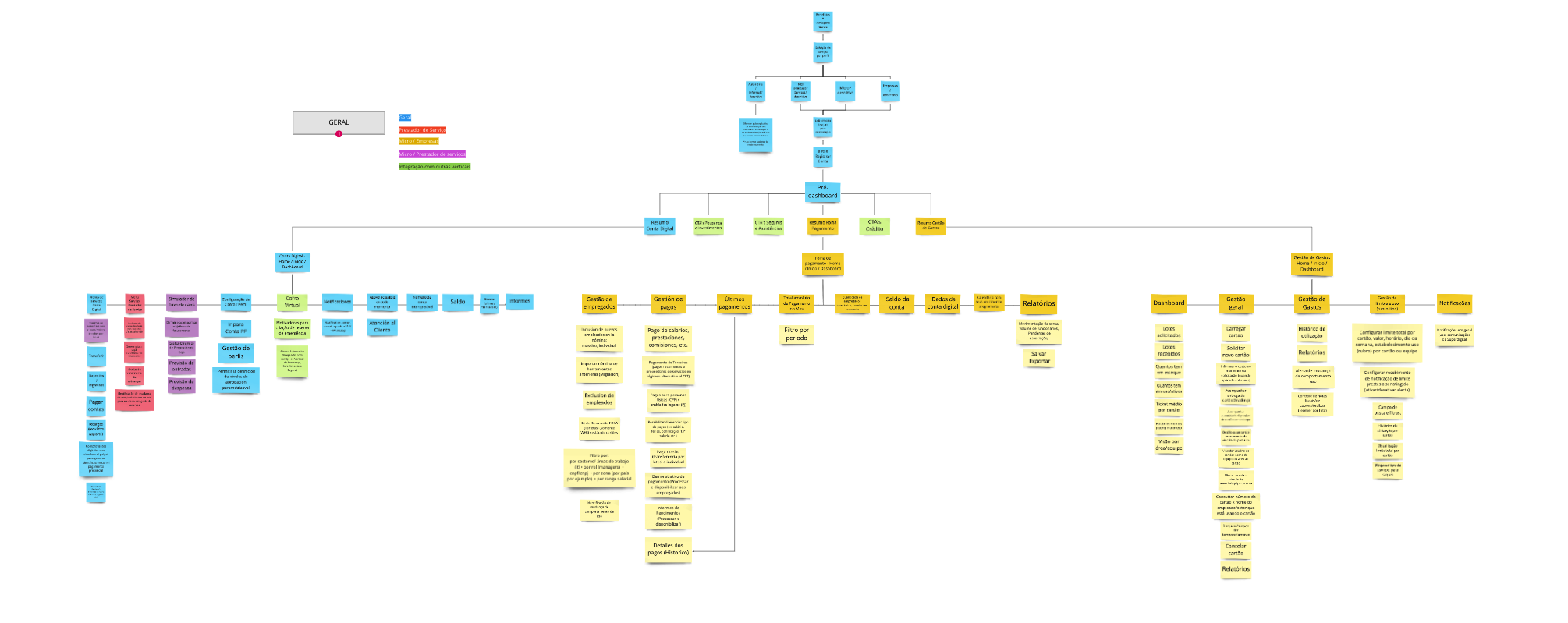
With the defined products and features, we have designed the product's sitemap as a whole.

Layout & Prototyping
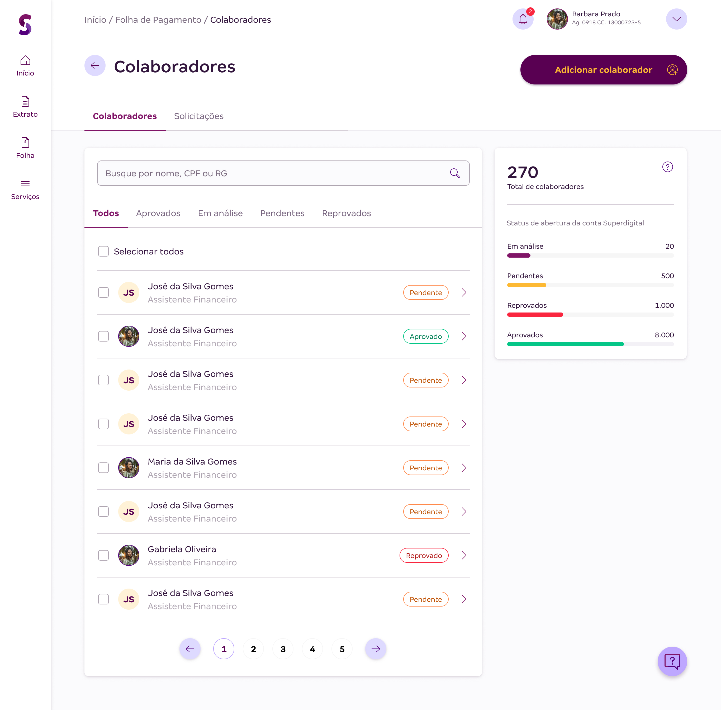
At this stage, I was responsible for the payroll product. I collaborated with the Product Owner to understand the business rules of the products and deliver the final prototypes.


Usability Testing
We conducted usability tests on the key workflows: Navigation, Employee inclusion, Individual and Mass payment. All of them were successfully completed, but we observed that users took longer to find the mass payment button. As a result, we made adjustments to make it more prominent in the layout.
At the end of the test, we received positive feedback on the overall product concept.
Here are some quotes from users:
“
You have an initial task to register the collaborators, and afterward, you only need one click to make the payment.
Brazil
In a traditional bank, it takes much longer to find operations. Here, it was very practical and straightforward. Anyone can learn it in about 15 minutes. It's quite compact with easy visualization. It has everything to succeed.
Brazil
Good experience, the page is easy to understand, user-friendly, and there are no small fonts.
México
User-friendly system, can be used even without extensive computer knowledge.
México